Also see Timeline at official IMO website. Click on Year to see the logo.
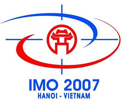
The two perpendicular lines signify the co-ordinates of maths as well as the meridian and the parallel of latitude. The symbol of Hanoi capital (temple of literature, the first university founded in 1076), located at the intersection point of those two lines indicates the place where the 48th IMO will be held.
The two curved lines imply the interior powerful tension turning around the Hanoi symbol. On the one hand, it symbolizes the convergence, association, solidarity and friendship of youth at IMO, on the other hand it creates the image of the torch light, symbolizing the discovery of talents, the creativeness of youth, enhancing the Maths work to serve the noble objective of human being.

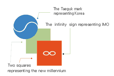
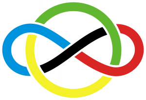
The logo is made up of a combination of the IMO symbol
(![]() ),
two squares
(
),
two squares
(![]() )
representing the new millennium with each square meaning one thousand years,
and the Taeguk mark
(
)
representing the new millennium with each square meaning one thousand years,
and the Taeguk mark
(![]() ),
the symbol of Korea.
All together,
the logo symbolizes IMO-2000 to be held in Korea
in the beginning of the new millennium.
The three primary colors, red-green-blue,
that can produce all colors,
stand for the beauty and power of mathematics,
which is the basis of all science and technology.
),
the symbol of Korea.
All together,
the logo symbolizes IMO-2000 to be held in Korea
in the beginning of the new millennium.
The three primary colors, red-green-blue,
that can produce all colors,
stand for the beauty and power of mathematics,
which is the basis of all science and technology.